
 The employment numbers released this month were less than exciting, and we went looking for a broader view of those numbers for the construction industry so that we could put them into context.
Calculated Risk is a Finance and Economics blog produced by Bill McBride since 2005 and is listed as one of the Best Economics Blogs by the Wall Street Journal. McBride has provided one of the clearest views on the industry and the unemployment figures that we have found.
A recent article entitled Employment Report Graphs: Construction, Duration of Unemployment and Diffusion Indexes gives us a long-term graphic view of the figures that BLS released June 1. Looks to me like our industry employment figures are about the same as they were in the late 80s.
Take a look at their interesting gallery of 20 graphs covering employment figures for a variety of sectors from the recessions of the past 50 years to the seasonal retail hiring and beyond. I like them and having this collection in one spot makes for entertaining information of normally dry economic data.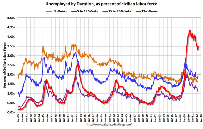
Graph courtesy of Calculated Risk.

Add new comment